Components in React

I am a frontend engineer with a passion for exploring new web technologies, I bring a vast knowledge of jQuery, JavaScript, React, Next, context API, and Redux to every project. With a keen eye for detail and a focus on delivering exceptional user experiences, it is my responsibility to code, style, and create reusable components that adhere to UI specifications. My goal is to help you bring your ideas to life, and I'm always eager to collaborate with others on new and exciting projects. Whether you're looking to create a sleek, modern website or a cutting-edge web application, I have the expertise and creativity to make it happen. If you're interested in learning more about me or discussing project ideas, please don't hesitate to reach out. I'm always looking to expand my network, and I would love to connect with you!
React is a free and open-source front-end JavaScript library for creating user interfaces based on UI components. It is also known as React.js or ReactJS.
But first, here is a quick overview of React taken from the documentation. One thing you should think about when getting started with React is understanding its components and choosing the one that best suits your needs.
We'll examine what components are in this article as well as the different kinds of React components.
What are Components?
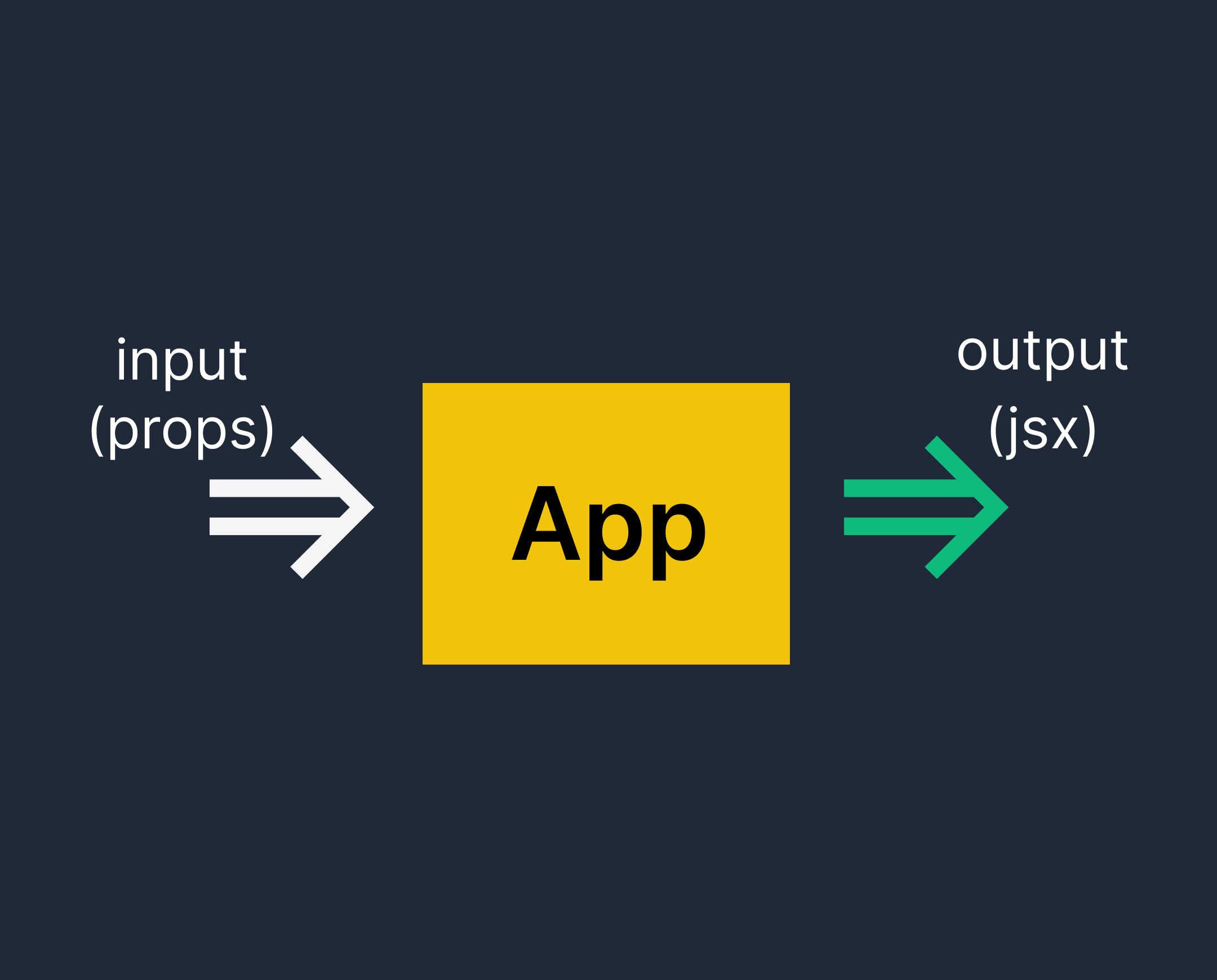
Simply put, a component is an optionally accepting JavaScript class or function that produces a React element that specifies how a particular section of the UI (User Interface) should look. Any React app depends on components, and a typical React app will have a lot of them.
The use of React components enables you to separate the user interface into manageable, reusable pieces. A capital letter must be used at the beginning of a component's name when creating a React component.
Creating your first Component
const GreetingMessage = () => <h1> Hello, Welcome Back! </h1>;
The above component is a functional component (called GreetingMessage) that uses the arrow function syntax of ES6 and returns an H1 tag with the text "Hello, Welcome Back!" without asking for any additional parameters/properties(props).
This brings up the different types of components in React: "Stateless" and "Stateful" respectively.
Functional or Stateless Component.
Class or Stateful Component.
Functional or Stateless Component.
These are presentational components that are represented by functions; they accept optional input in the form of props and return a React Element (or jsx) in the form of a rendered page.
There are three (3) points you should note in this component: Functional, Stateless, Presentational
The above code snippet as mentioned is the simplest form of a functional component, consider the below code snippet.
function Login = () => {
return (
    <>
        <form>
             <input type = "text" placeholder = "username" />
             <input type = "password" placeholder = "password />
             <button type= "submit"> Login </button
        </form>
    </>
)
};

export default Login
Class or Stateful Component.
These components were developed utilizing the class syntax of ES6. They also have a few extra features like the capacity to hold logic (for instance, methods that handle onClick events), local state, and other abilities.
The extends React.Component statement, which creates an inheritance to React.Component and gives your component access to React.functions, Component's must be included in the component.
class GreetingMessage extends React.Component {
  render() {
    return <h1>Hello, Welcome Back!</h1>;
  }
}

// This is the simplest form of the class component
In Addition
While using React Components, there are a few things to keep in mind, specifically:
Props.
State.
LifeCycle
The aforementioned subtopics are not covered in this article; however, I will soon share my opinions on them. Please keep a sharp eye out.
Please leave any comments or suggestions in the comment section.